 vyuh
vyuh Diagram
Tables
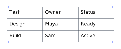
A table can be a standard standalone element or a ShapeTable within another shape's body. It is part of the text grammar, so editing, selection, undo/redo and layout use the same canonical story machinery.
Editing and navigation
| Input | Behavior |
|---|---|
| Double-click text | Enter editing and select the tapped word |
| Double-click blank cell space | Enter editing with a caret in that cell |
| Click an unselected table | Select the whole table; dragging moves it |
| Click a cell in a selected table | Enter cell selection |
| Drag in cell selection | Select a rectangular range, without a modifier key |
| Click the selected cell again | Enter text editing |
| Escape | Step back from text editing to cell selection, then to table selection |
| Drag while editing text | Select text; does not select cells |
| Delete with cells selected | Clear their contents, preserving the table structure and formatting |
| Tab | Next cell in row order; wrap to the next row; append a row at the table end |
| Shift+Tab | Previous cell in row order |
| Enter | Insert a row below and continue in the same column |
| Shift+Enter | Add a line within the current cell |
| Up/Down | Move through lines, then cells in the same column |
| Left/Right | Move through text and adjacent cells in row order |
Cells support styled body text. They do not support headings, lists or nested tables.
Sizing
Columns start equally sized within the allocated width unless explicit widths are authored. Cell content determines minimum sizes. Text can wrap; rows grow to fit content. Minimum column widths preserve at least a character and padding; minimum row heights preserve a line and padding. These are measured constraints, not a promise that arbitrarily long text will keep every column equal.
Hover a divider and drag to change that row's height or column's width. The inspector's Rows & columns section provides the same explicit sizes. Resizing a track preserves the neighboring track's size and changes the table extent, subject to the resolved minimums and the containing body's layout. An embedded table can therefore increase the required size of its containing shape.
Structure and borders
Selected tables expose editing controls that rotate with the table. Full shows only the row and column intersecting the hovered cell. Gutter handles select an entire row or column without opening a menu. Dots at the adjacent boundaries become plus buttons on hover and insert tracks there. Moving into the gutter keeps the controls reachable. Minimal shows one domain-specific actions menu, using the active cell as its row/column target. Off hides this chrome without disabling editing or inspector commands. Embedded tables retain their declared capabilities; a properties-only table can omit all column controls. Pop-up menus remain upright.
Configure this when installing TableFlutterExtension; its arguments build its TableFlutterOptions:
dart
TableFlutterExtension(
  standalone: TableOverlayMode.full,
  embedded: TableOverlayMode.off,
  // Optional per-owner/table policy; no document content is changed.
  resolve: (owner, table) => owner.isLocked
      ? TableOverlayMode.off
      : TableOverlayMode.full,
)
Omit resolve to use the shape's declared presentation and the standalone/embedded defaults. The table behavior reads the options live, so controller.edits.setOptions(controller.options<TableFlutterOptions>().copyWith(...)) changes them at runtime. Embedded regions are hidden by default. Only the active table shows controls. Locked tables do not show editing controls. Add, insert and delete actions use the same undoable commands as the inspector, and do not override text deletion shortcuts.
An embedded component declares its own vocabulary and structural permissions:
dart
const ShapeTable('properties', rows: 2, columns: 1,
  controls: ShapeTableControls(
    presentation: ShapeTableControlPresentation.compact,
    columns: false,
    rowLabel: 'property',
    renameRows: true,
  ),
)
This exposes Add property, Rename property, and Remove property. Rename selects the current property's text for editing. Column actions are absent from the overlay and inspector, and column commands reject changes. The entity shape's sections use a similar compact, column-free declaration. Hosts can still hide the entire overlay through resolve.
Operation capabilities
ShapeTableControls.capabilities declares the operations the component permits. ShapeTableCapabilities independently controls mergeCells, mergeRows, unmergeCells, addRows, removeRows, addColumns, removeColumns, resizeRows, resizeColumns, and resizeTable. Each defaults to true. The existing rows: false and columns: false switches remain broad restrictions on their respective track operations.
For an embedded property list that permits adding and removing properties:
dart
const ShapeTable('properties', rows: 2, columns: 1,
  controls: ShapeTableControls(
    presentation: ShapeTableControlPresentation.compact,
    columns: false,
    rowLabel: 'property',
    renameRows: true,
    capabilities: ShapeTableCapabilities(
      mergeCells: false,
      mergeRows: false,
      unmergeCells: false,
      resizeRows: false,
    ),
  ),
)
Overlays and the inspector omit unsupported operations. Commands reject them without changing the document; keyboard-driven row creation uses the same policy. Changing overlay visibility does not change these permissions.
mergeRows applies to a selection spanning every column of one or more rows; mergeCells applies to other rectangular ranges. Both produce one merged cell, preserving the underlying tracks and content for unmerging. They do not delete rows. resizeTable: false disables explicit resizing of the owning shape, including its resize handles. Content-driven growth still follows the shape's layout grammar. For embedded tables, leave it enabled if the containing component should resize and let its table fill the resulting bounds.
The inspector inserts or removes tracks, retaining at least one row and one column. Choose Table, Row, or Column to choose the scope of the border controls beneath the tabs:
- Table: outer border, all row dividers, or all column dividers.
- Row: the divider below the selected row.
- Column: the divider after the selected column.
The same style, width and color fields load the chosen scope's values. Switching scope does not edit the document. An individual divider override can be reset to the table default. The last row and column have no following inner divider; use the outer border to edit the table edge.
Cell-selection mode supports ordinary dragging; the row and column gutter handles select their whole track. The selected range has one outer selection outline and a subtle tint, while normal internal table dividers remain unchanged. Use Merge cells for a rectangular selection and Unmerge to restore its individual cells. Merging preserves existing row heights unless the combined content requires more space. Empty cells do not add extra blank paragraphs. The Clear action (eraser icon) clears selected cell contents, preserves the selection and merges, and can be undone. Cell-selection mode uses a crosshair; text editing retains the text cursor.