 vyuh
vyuh Diagram
Standard element catalog
These illustrations show the standard elements selected, with blue selection outlines and editing handles. They are drawn from the same definitions and selection chrome as the editor. They show sample content; the image element shows its empty image placeholder, and the group example shows two grouped children because a group has no painted surface.
Rectangle
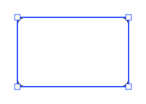
A general-purpose block with one inset text region. Change its fill, border color, width and style, and corner radius. Resize from sides or corners and rotate it.
Ellipse
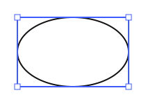
A circle or ellipse with a proportionally inset text region. Supports fill and border styling. Width and height are independent; equal dimensions produce a circle.
Polygon
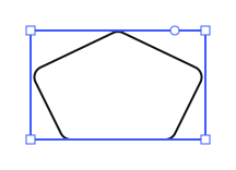
A regular polygon with an editable side count, fill, border and corner radius. Text occupies an inset region. Connections can use the resolved outline; these anchors are different from authored, named ports.
Path
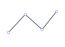
An authored path for straight segments and Bézier curves. Select individual anchors, move or delete them, add points, and toggle open/closed geometry. Double-click an anchor to cycle corner, smooth and symmetric point types. Deleting an endpoint of a two-point path removes the path. It has no text region or ordinary bounding-box resize handles. Shortcut: P.
Drawing
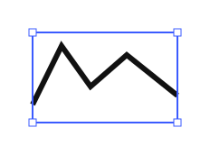
A freehand stroke with authored points. The inspector exposes ink presets, color and width. Pen strokes can carry varying widths; presets determine the ink behavior. The standard definition also permits a text region. Drawing is distinct from editing Bézier anchors on a Path.
Card
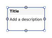
Independently addressable text regions: an optional tag, a single-line title and a plain-text description (body). The tag shows only while it has text; the editor offers an add or remove tag button beside a selected card. The header has a fixed background surface. The card supports editable surface styling, rounded corners, height growth from content, and named ports on its four sides.
Comment
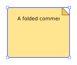
A text note with fixed yellow paper, outline and dog-ear fold. Its body is editable and can grow the shape vertically. Fill and border controls are deliberately absent: the paper and fold are fixed surfaces in its body, and the comment has no outline of its own. Shortcut: N.
Table
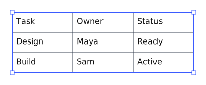
A nested text structure with editable cells and independently resizable rows and columns. Configure outer borders, all row/column dividers, or a particular divider. It can stand alone or fill a declared region of another shape. See Tables.
Frame
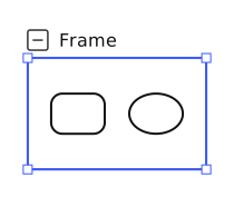
A visible container with a title above its top edge. Moving it moves its children; resizing changes the boundary without scaling them. Clipping and collapse are supported. Standard frames do not rotate. See Frames and groups.
Group
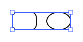
A logical container with no painted fill, border or title. Moving, rotating or resizing the group transforms its contents together. It is created through grouping, rather than serving as another visible rectangle.
Image
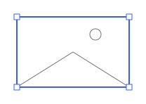
An image source displayed inside resizable bounds. Choose a file or URL and set contain, cover or fill fitting. The demo file picker accepts PNG, JPEG, GIF, WebP, BMP and SVG. SVG images are drawn as images; the original source remains in the document. This does not promise vector-preserving image export or support for every SVG feature. No built-in caption or surface fill/border controls are provided.
Text
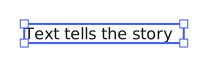
Rich Text without a shape surface. Supports font, size, color, inline marks, alignment, paragraphs, headings and lists. Click-created text starts with automatic width; a width-constrained text box wraps content. See Text and regions.
Connector
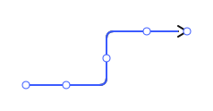
A relationship between free endpoints or attached elements/ports. Choose straight, orthogonal, quadratic or Bézier routing. Edit stroke color, width/style, end markers, label placement and supported path effects. Moving attached shapes updates the connection. Shortcut: L. See connector API.